PT-BR
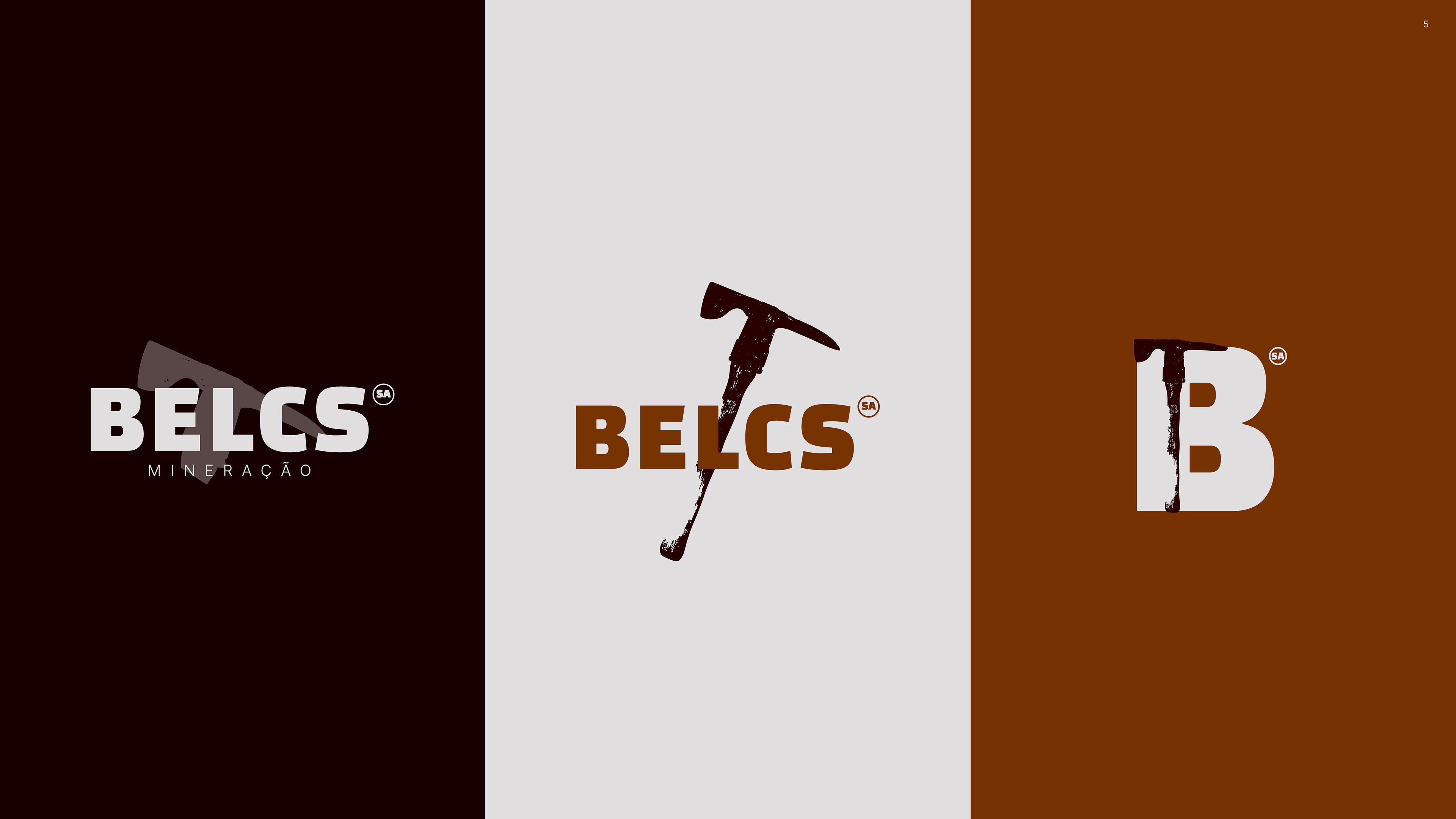
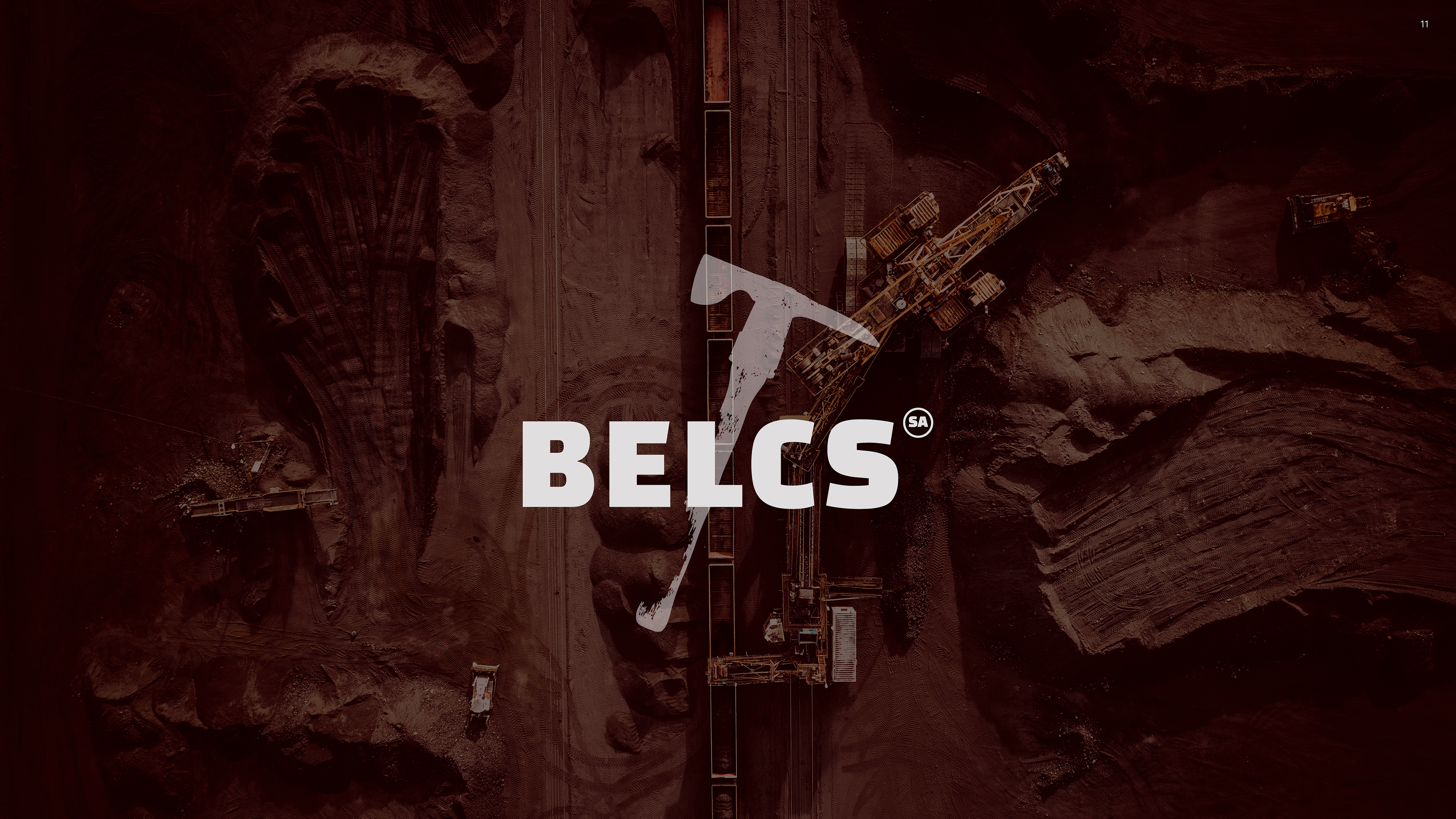
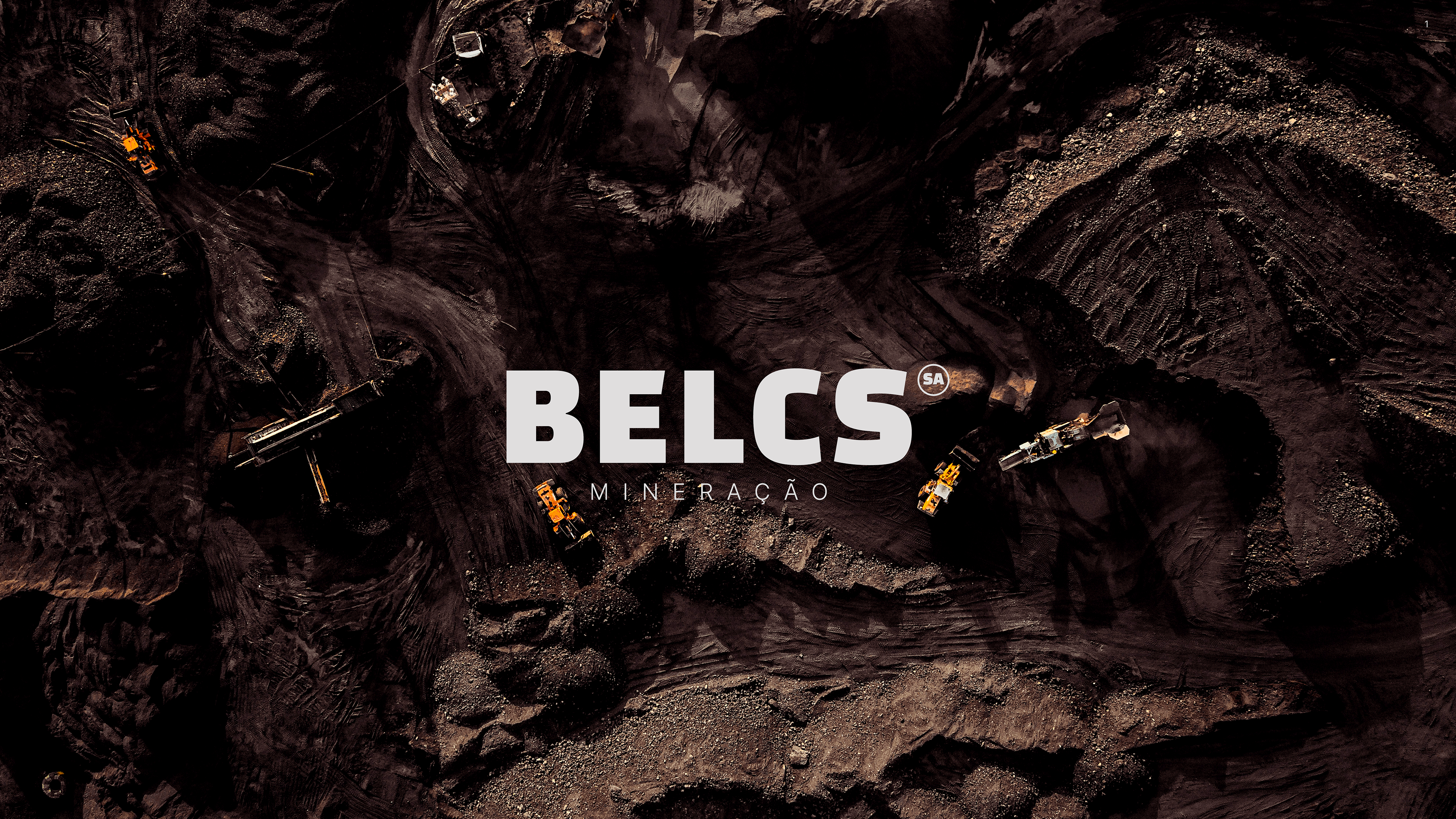
Belcs é uma nova empresa de mineração que atua com a extração e comércio atacadista de minério de ferro em Minas Gerais.
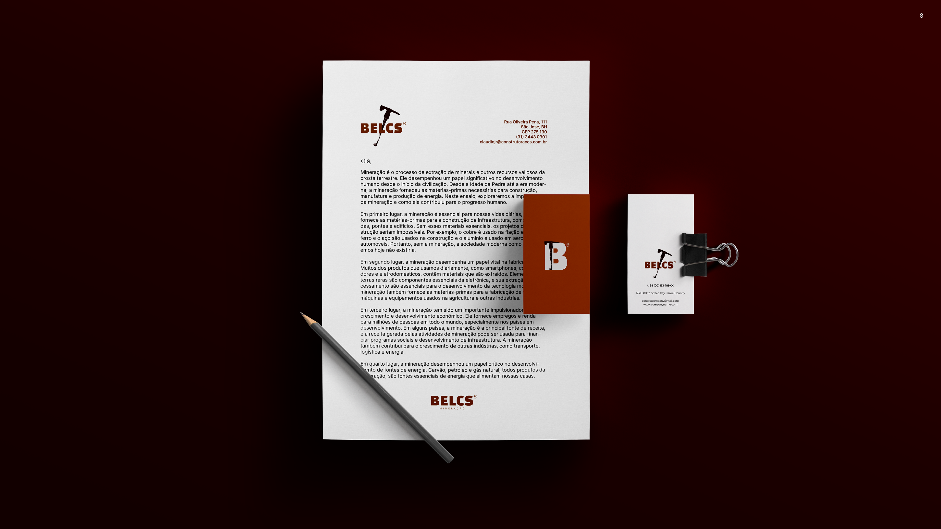
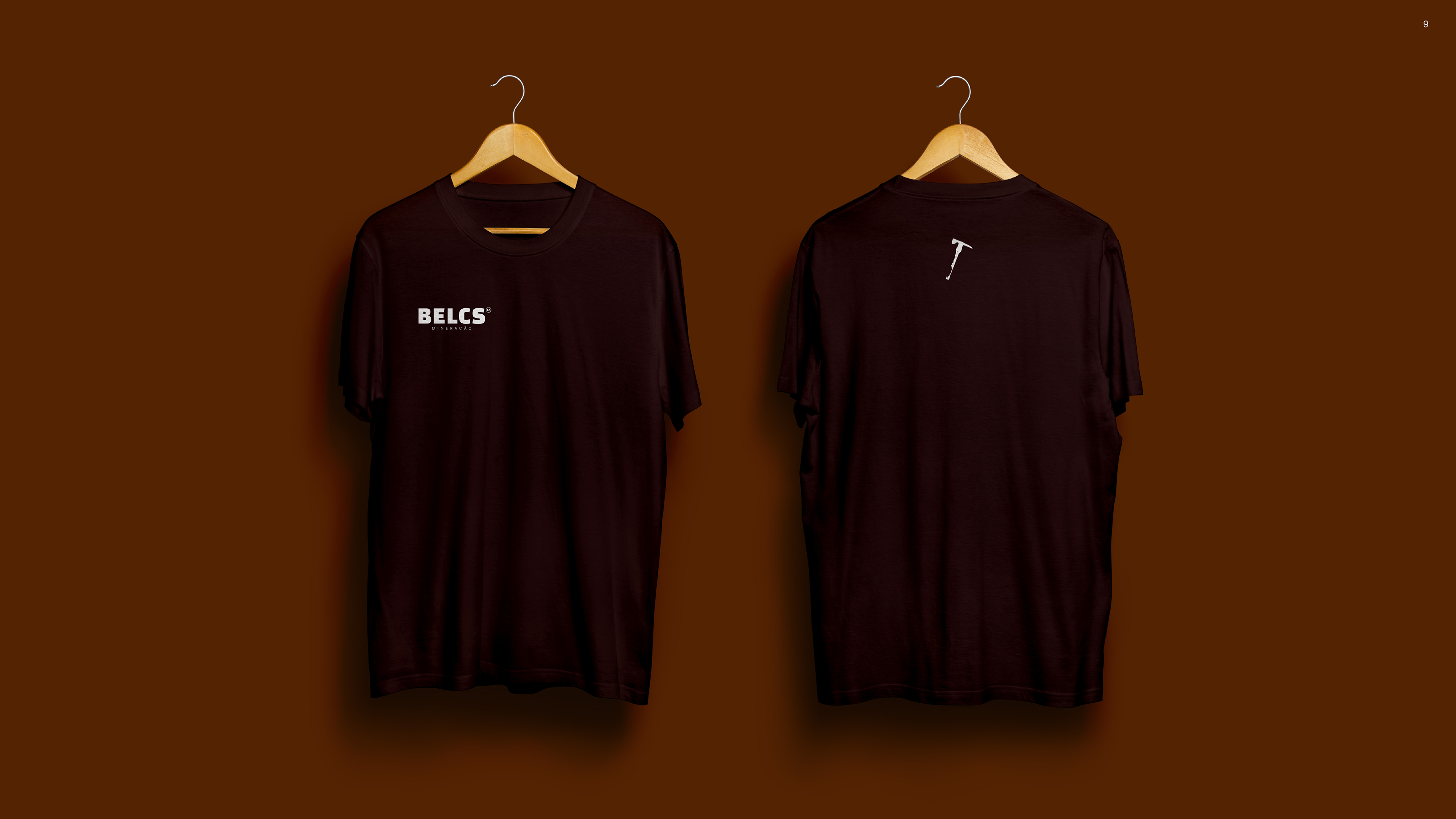
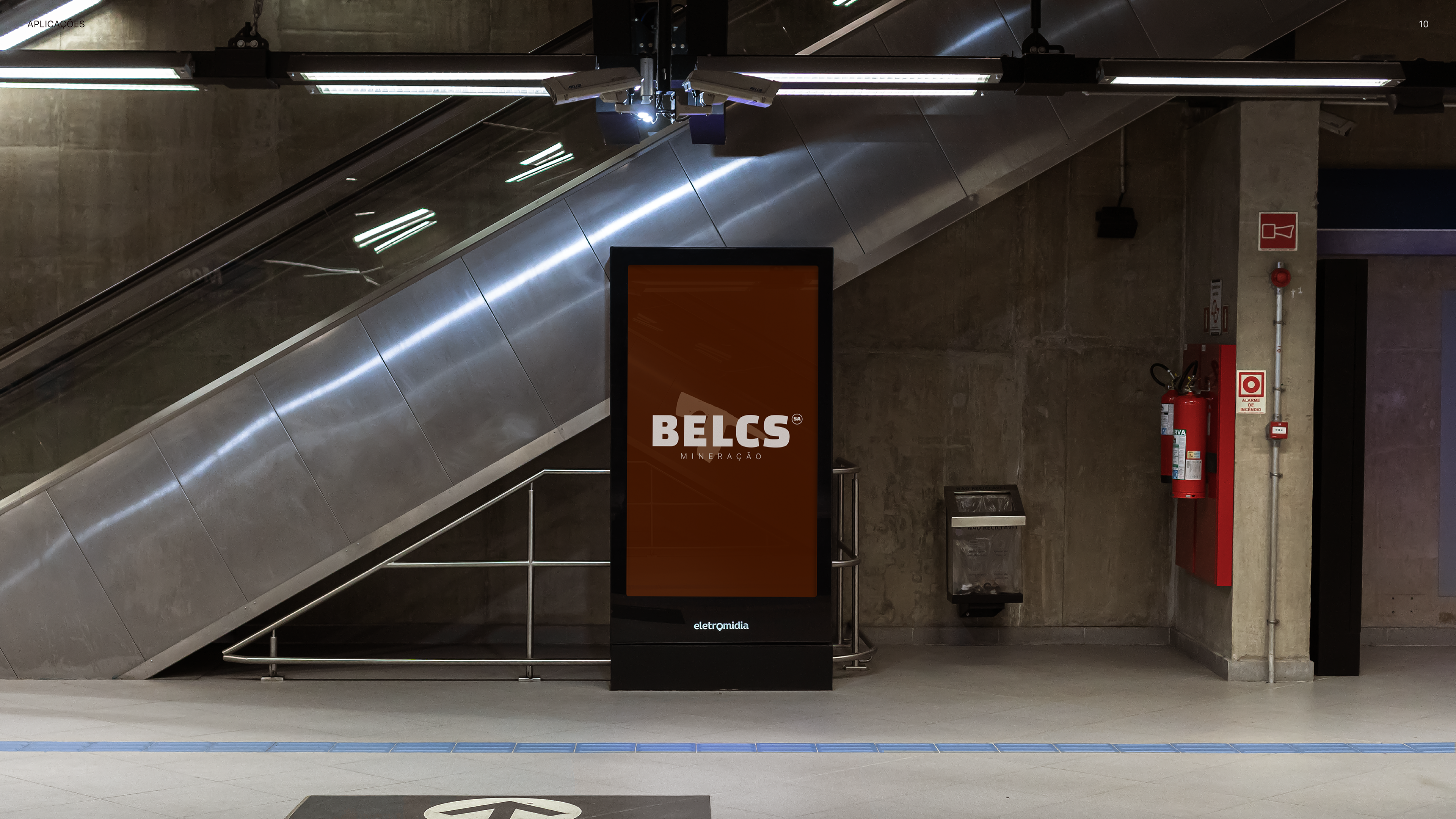
Sua identidade visual precisa ser forte, memorável e se adaptar ao negócio em que ela atuará, com versatilidade e presença fortes.
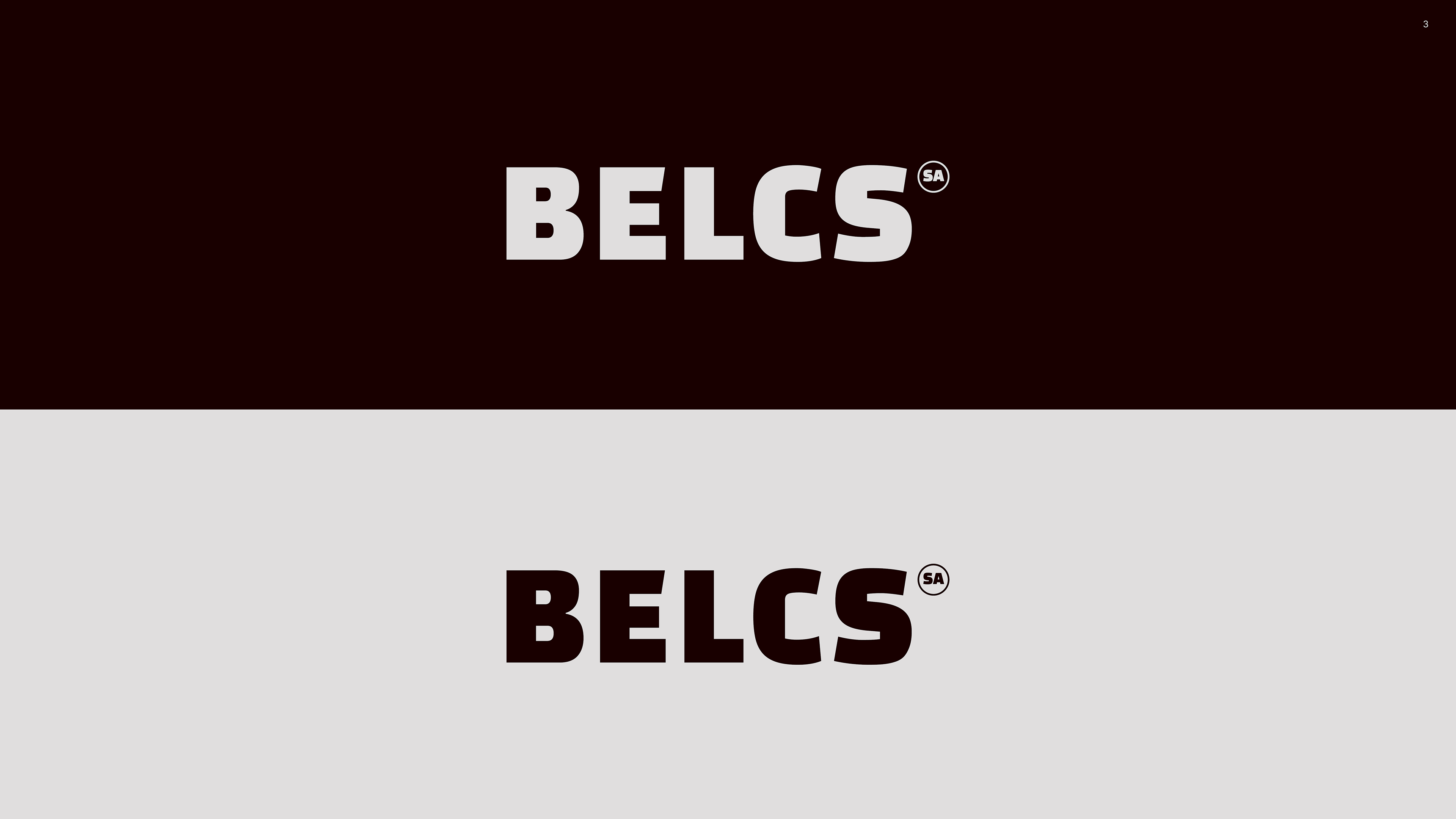
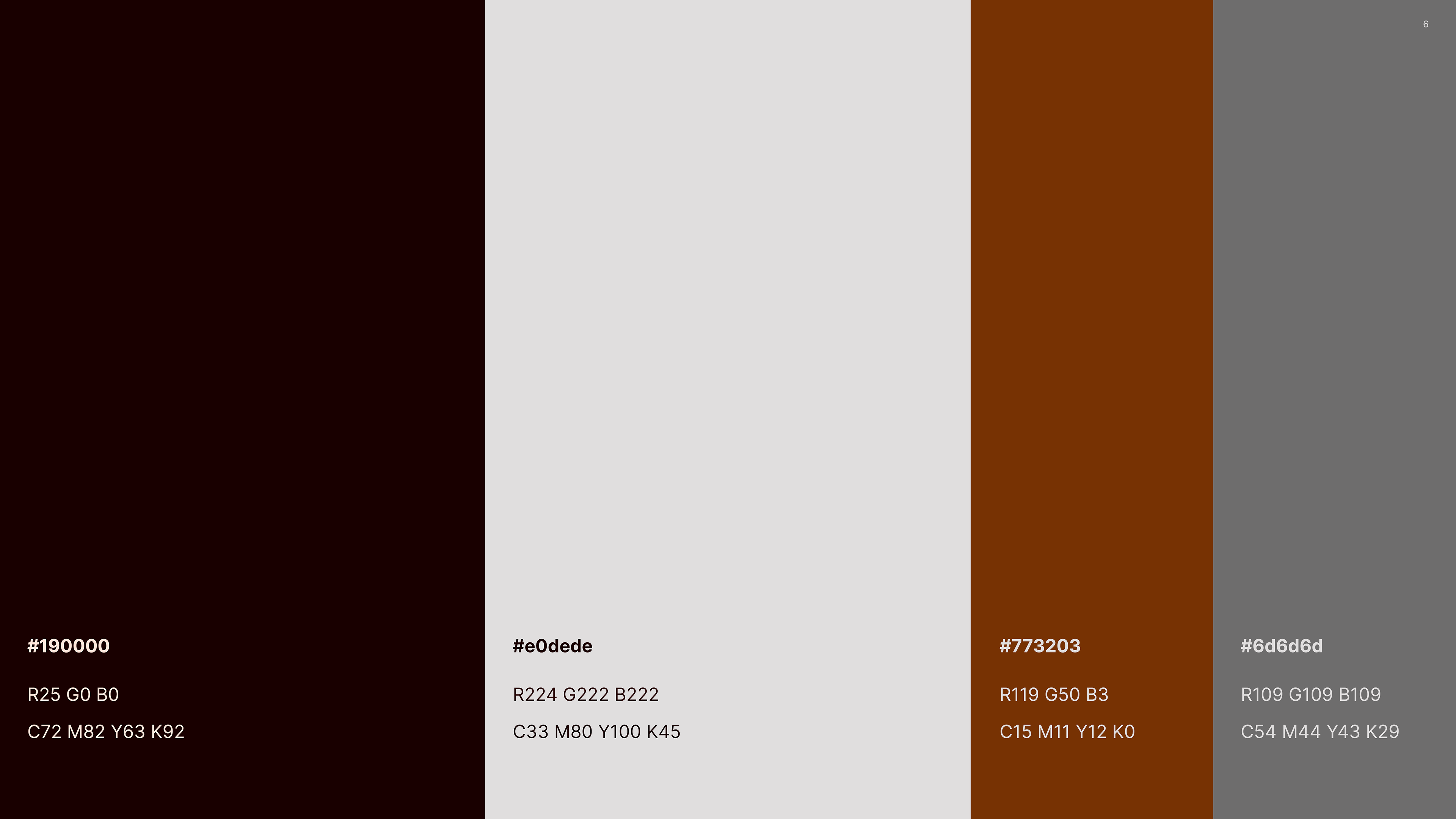
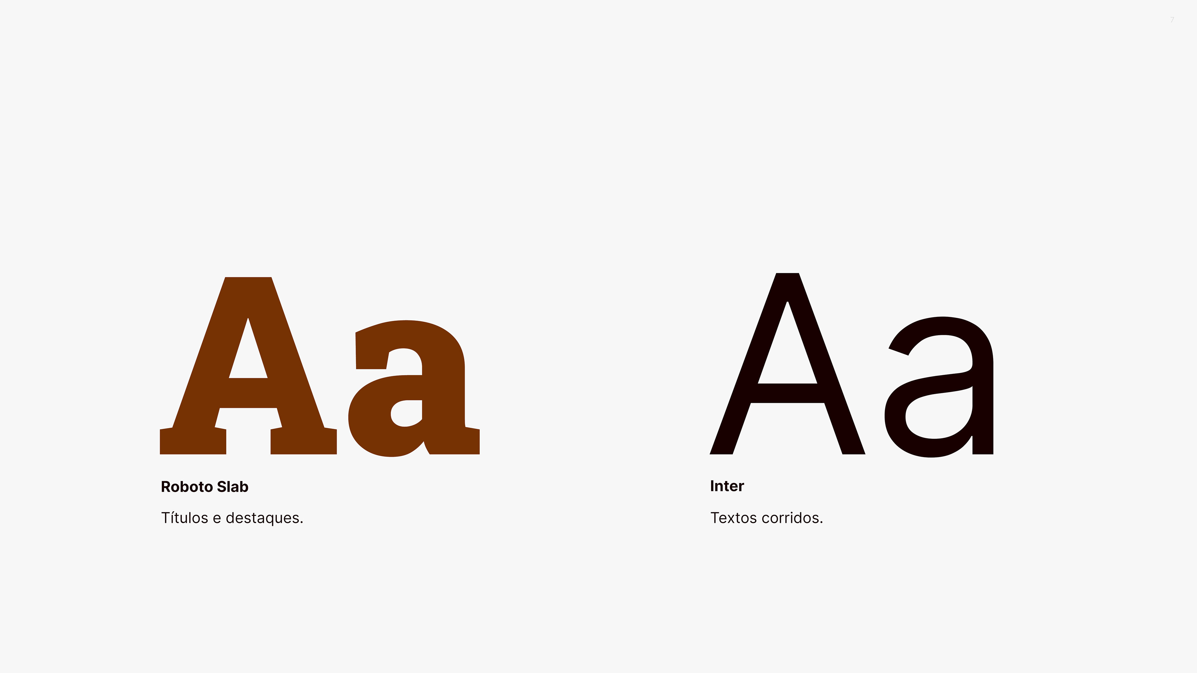
As cores escolhidas fazem referência tanto ao minério em sua forma natural quanto aos produtos obtidos dele. Além disso, passam confiabilidade e solidez. A tipografia escolhida é fácil de ser usada e identificada.
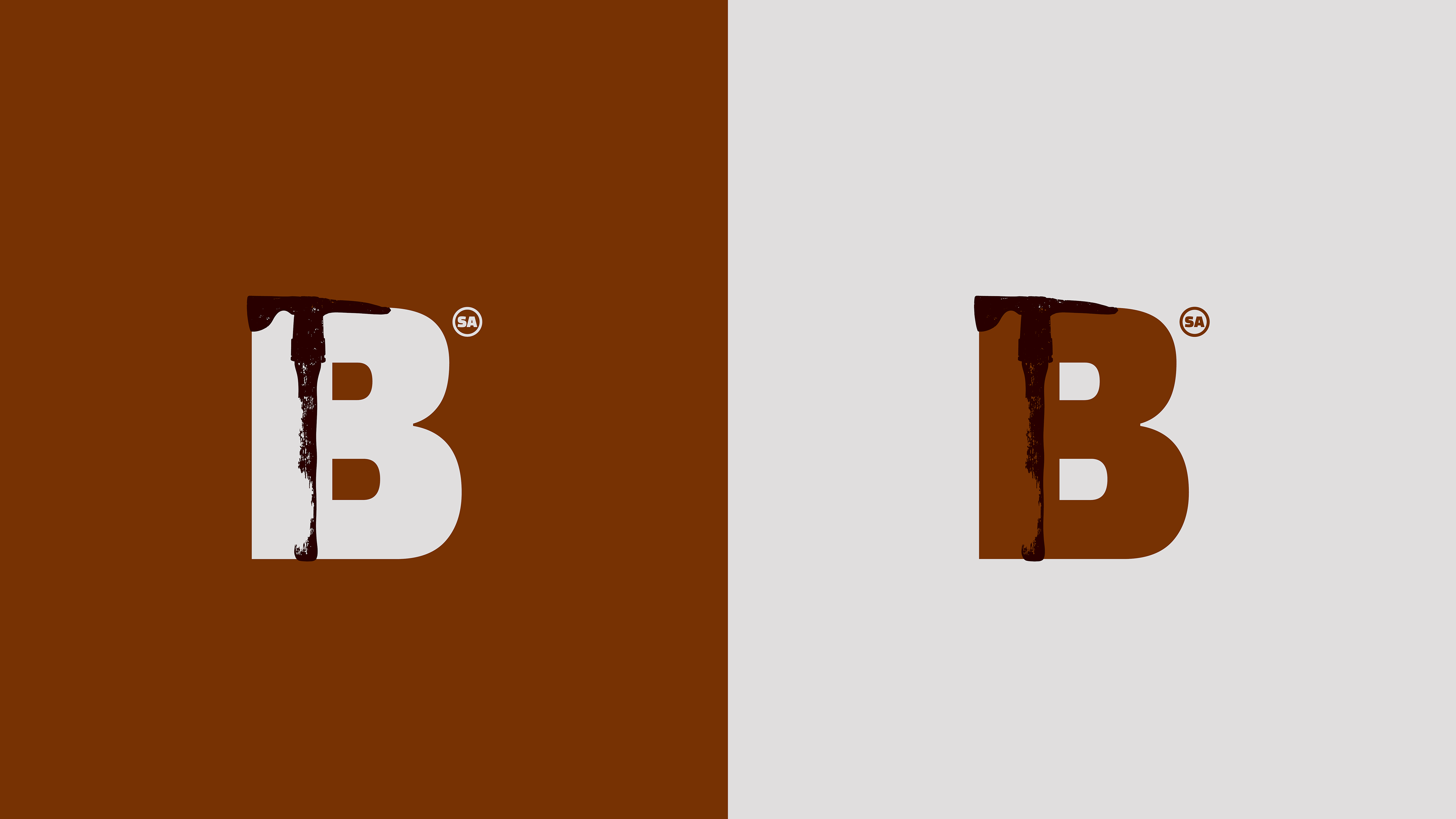
Por fim a ilustração contribui para a construção do universo da marca, transmitindo seriedade e tradição.